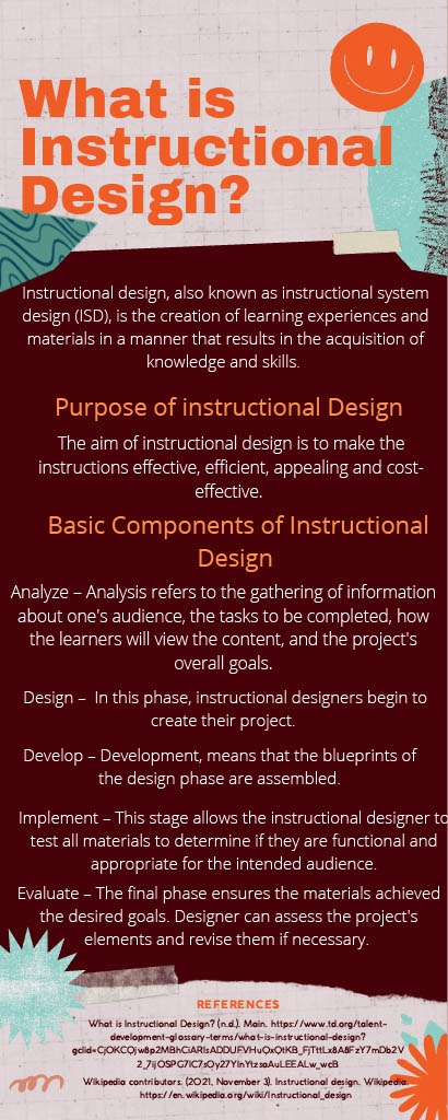
This is the original infographic that I created on week 3. Because my blog post on week 3 is a personal reflection about Dr. Merrill’s thoughts on Instructional Design. Therefore, I created one infographic about instructional design, hope everyone can understand what is it first by reading this.
However, I realized that I have some problems need to revise on this project after I learned some principles about how to reduce extraneous processing for better learning.
First, the biggest problem is I forgot the principle of “people [actually] learn better from words and picture than from words alone (2014, Mayer, p1).” So, I must add some relevant images on the infographic. Plus, according to the principle of Split-attention principle, it also proves that “people learn better when words and pictures are physically integrated (2014, Mayer, p8).”
Second, I should follow the Coherence Principle to reduce my words and simplify them, then people might keep interested on reading my context.
Third, I notice that it’s better to highlight those five basic components or either use some other way to protrude these five words. Because according to the Signaling Principle, people learn better when they know what is the most important things. Therefore, I choose to make the size of heading bigger than the body part, and also bold each heading.

Reference:
Mayer, R. E. (Ed.). (2014). The Cambridge Handbook of Multimedia Learning (2nd ed.). Cambridge University Press. https://doi.org/10.1017/CBO9781139547369
Leave a Reply
You must be logged in to post a comment.